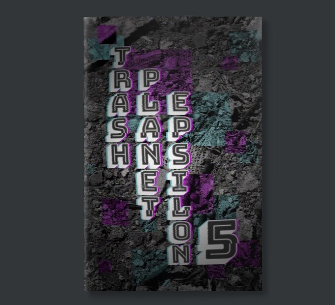
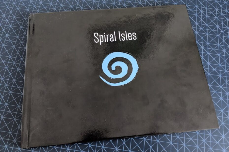
Spiral Isles is an OSR pointcrawl adventure successfully kickstarted at the beginning of April this year. It was co-written by Jere Hart and Lazy Litch (Shane Walshe), the latter of which also created Woodfall. Given I also backed Woodfall back in August last year, and was pleasantly surprised with what was delivered, I was more than happy to put down the money to get my hands on this new project!
Let’s take a look at what got delivered…
The Product
Like Woodfall, Spiral Isles was delivered as a PDF, with an at-cost print on demand code (for hardback or paperback) from Drive Thru RPG. I opted for the hardback, so I cannot speak for the paperback but, as is expected of POD, the quality isn’t “premium” to put it lightly. It’s perfectly serviceable, and Spiral Isles does make use of coloured printing which is one minor improvement over Woodfall.
 |
| I’ve tried to make it look as pretty as possible! |
As you can tell from the pictures, the book has a landscape format. This is an odd choice for a book intended for use at the table. I much prefer my novel size supplements that are compact enough to carry around and easy to flip through when I’m running them. There is no practical way to “flip” through this without laying it flat on a fairly large table. What makes this choice even more frustrating is that the layout doesn’t even take advantage of this in any way! And no, the “Die drop tables” don’t count, we will be discussing those later…
It would have been nice to see a project from Lazy Lich delivered as a more bespoke product. It’s perfectly serviceable don’t get me wrong, I’m just not filled with glee upon opening it like I am with other OSR adventures on the market. Having said that, this is far cheaper than those fancy games! At $22/£17.50, it’s cheaper than your standard WotC affair, which aren’t really any better quality…
The Content
Moving on, the content is really where this adventure shines. The basic concept behind the Spiral Isles is that they are a location you can take your players after a TPK, when they want to bring someone back from the dead without magic, or otherwise visit the afterlife. It’s a great adventure to have in your back pocket so that a session (or even a campaign) does not have to end at a party wipe. Certainly it’s something I have not seen explored before.
The Rules
Lets kick off with the rules that this supplement provides. As advertised on the kickstarter, the whole module is compatible with both the 5th Edition of Dungeons & Dragons (5e) and Swords and Wizardry (S&W) rules sets. What this really means is that Monster/NPC stat blocks are written with all the details required for a 5e monster, which as far as I can tell, means they are also compatible with S&W. It also means that the ghost conversion rules are written for both systems. Ah yes, ghost conversion!
Going Ghostal
So the core conceit within this adventure is that players are ghosts while in the Spiral Isles. What this means is that players basically file away their character sheets, and role up a blue ghost. A blue ghost is basically a level 0 character, with all Ability scores at 9, no skills no abilities and just 1 hit dice. What you do get are a special new Power and a new pool of points to keep track of on top of HP; Life points. There are 4 “ghost levels” you have access to. In ascending order they are Blue, Green, Red and Purple and are basically levels 1-4, except you have no class, and you will only ever have at most 2 special Powers. You get some skill bonuses, proficiency bonuses and get to add a few points to your abilities, but your always going to be under powered, low level characters.
Re-rolling by another name
Before we get into what the Life Points and Powers are and if they are any good, lets first address this conversion idea as a concept. It’s kind of weird. On the one hand it’s quite clever, because it allows the designer to basically write a mod for the game your group is already playing. If your running 5e, you use all the 5e rules, your just playing with slightly different character rules. The same goes for S&W. On the other hand, there is very little that connects this new character, to your previous one that is supposed to have died. Nothing in the rules actually links them in any way other than their name. They are a class-less blank slate that your free to progress in an entirely different direction to your original character.
While this does give a sense of disconnection with the original characters, perhaps this is intentional! In a sense, perhaps these spirits the players now control, are the most basic distillation of their original character. The only thing that remains are their memories and personalities. It’s kind of poetic I guess, and it’s at least thematic. If I were to use these rules at my table, I would probably add my own on top, only allowing players to raise ability scores to the values of their original character, or allowing them to regain spell casting abilities in place of powers. I do largely like the idea though. It allows this portion of the game to play out potentially faster than the original game. Certainly, simpler characters will hopefully encourage more inventive play, and stop players looking for answers on their character sheets in true OSR fashion! It’s probably a good way to gently introduce players unfamiliar with the OSR to its ideas and playstyle. Neet.
HP 2.0
So the new stuff you get is basically two new systems that feed off each other. Life points are a revamped version of HP, and Powers are spells you cast using these new fangled Life points. The Powers themselves are fairly mediocre. D&D spells by another name for the most part, nothing really very interesting. From what I can tell at higher levels they can be cast at different Power levels like in regular spells in 5e, but this isn’t actually made clear in the rules. There are about 3 paragraphs about how the Powers work, and two of those are how they work in 5e vs S&W. I’d probably come up with my own.
So while the game asks you to do away with all your original abilities and spells from the original game, it provides you with a little replacement system, and a new number to track. It’s a little more complex than that, but that’s the basic gist. The new Life Points are also a universal currency throughout the Spiral Isles. They can be transferred between characters (and monsters for that matter), and they are also used in place of XP to level up through the ghost colours.
This is… cool… sort of. I dunno, I can’t help feel the designers have only gone half hog with this idea. Why do we still have HP? I get it, I guess. They probably don’t want damage to remove Life points, but still, it’s kind of frustrating that you now have two HP-like point pools, that if either are depleted you die for good. I really like the idea of a universal resource for buying stuff, leveling up and using cool abilities. I think this will lead to lots of really difficult decisions on the part of the players, balancing buying cool gear, using cool abilities, and gaining enough to level up. It’s something I would love to steal for a micro-RPG project.
What’s even more interesting is the whole political landscape of the setting revolves around them as well. Characters judge you based on your colour, which is effectively how rich you are. Fantastic! There are even certain areas and events in the Isles where your colour affects what NPC attitudes and if you’ll be shunned or accepted without question. I can already see a mountain of potential drama setup with this mechanic. Very nice.
So in summary, I think the rules are pretty cool if a little half baked. I think they are a clever way to invoke some old school play in a new school game, and I think the life points add a really interesting new resource management mini-game I think would add new dynamic to your 5e game.
The Setting
Moving on, let’s look at what the majority of the book focuses on; locations, NPCs and Monsters.
Colourful Locations
The Spiral Isles are split into 4 regions; Blue, Green, Red and Purple quadrants. There are 22 individual islands, each with 2 – 4 locations.
The writing is fairly matter of fact. There is very little in the way of flowery descriptions. In some ways im actually a fan of this style. I wouldn’t say I prefer it to more evocative writing, but it serves a very different purpose to me as a GM. Instead of inspiring fantastic visions and unique atmosphere, it provides you with a wealth of specific details with which you can rely on while running. This frees up your GM muscles, allowing you to focus more on setting tone and detailing the landscape yourself.
And when I say a wealth of specifics, I mean it. Every location has a treasure to find, a trap to trigger, an NPC to exploit or an adventure seed to follow. Often a combination of multiple of these. While the treasure is often meager (I think it caught that disease from 5th Edition), the NPCs are dynamic with clear motivations. Often the author will explicitly explain what the NPC would want from the players, and how they may go about getting it. They may have different attitudes towards the players depending on what information they have uncovered, making the world feel reactive.
Not only are these locations brimming with great content, but its very varied and often quite unique. Your standard fantasy adventure bread and butter is here too, with plenty of caves, ruins, cities and hideouts, but some of my favourites are the really weird and wacky locations. There is a roman casino island with greasy loan sharks, various dice games and a fighting pit where players can gamble, fight and get into debt. One island is a geode filled with crystal amphitheatres hosting theatre toups where players can buy masks and props and try their talents in their own shows. Another is a huge tree hotel constantly celebrating a different festival from creepy cult ritual to drug fueled party. Amazing!
The Bad Ghosts
The Monsters are a variety of weird ghosties and fairly standard guards/bandits/cultists. I like the weird monsters, they have some interesting abilities and unique flavour, but they aren’t revolutionary. Nothing would be out of place in a vanilla 5e Monster Manual. The rival NPC party provided is especially uninspired. I feel like the art portrays far more interesting characters than the stat blocks portray, another symptom of the 5e-itis that this whole book suffers from. I like the idea though, the rival party slowly stalks the player characters the more they uncover the Spiral Isles’ secrets.
Functional, and handy to have if your running 5e and don’t want to thumb through another book i guess. However these monsters are nothing terribly special.
The NPCs and factions are another story however. We see the return of the faction table which was used in Woodfall. This time, it’s also provided for the major NPCs as well. This is incredibly useful, and really helps a GM should the players want to get involved in some political manipulation and intrigue. Im generally quite impressed by the details provided for the NPCs, and I do get a good sense of their unique personalities from their descriptions.
Anyway, we have said far too many positive things for a review, it’s about time we tackled the unfortunate elephant in the room with this adventure…
The Layout
To put it bluntly, it’s awful. I would even argue it isn’t even a taste thing, it’s genuinely, objectively, poorly laid out. Its difficult to reference, it’s often hard to follow where the text flows when reading, and it’s near impossible to work out some sort of hierarchy of sections in paragraphs. Just to really drive home the volume and severity of these problems, here is a vicious list of blunders and the issues they cause when using the book:
Font size is inconsistent.
This in itself is not usually a problem. Plenty of books do this to differentiate sections, tables or on a map text. However the text size here has no rhyme nor reason I can see, other than to ensure all the desired text fits on the page? It just creates confusion when determining the context of a paragraph. Take this How to Use page as an example. The table text is a different size, fine, but its not the same size in all other tables in the book, that varies considerably. The text at the top is slightly larger than the text below. Why? It makes me think the texts might are unrelated, but they aren’t!
 |
| Also why is the spacing between text and table not the same above and below? It just looks bad. |
Table formatting and implementation is inconsistent.
Sometimes information is presented in a table, but sometimes it’s just a numbered list, and sometimes that numbered list is in a paragraph of text! Some tables are numbered, others are not, some provide a dice size to roll in the header, others are just numbered. The formatting is woefully inconsistent. Font size varies, text alignment doesn’t fully make sense, and some column headers don’t seem to align properly. This makes using them often more difficult than it needs to be. The rules for how to use one table are different from the last. Having to read through a paragraph of text to find a list to roll on is just not practical at the table, but putting that aside, it’s not even a consistent feature I know to look out for.
 |
| Just a brief selection of the various table heading formats… |
Also, on a related note, the treasure table is split into 4 seperate d20 tables. They don’t seem to be in any way split in a logical fashion, just randomly. Why? Is it so that the basically pointless drawing of a generic treasure chest chat fit in? Could the designers not come up with another 20 entries for a d100 table? It’s just shoddy, and causes more inconvenience.
Paragraph columns are inconsistent.
The book broadly follows a three column layout for text. I say broadly because it’s in no way consistent. These columns vary in size and position page to page. Some pages only have two, or one. I’m also not counting where text sometimes spills over multiple columns, which is fine, but still looks bad in my opinion. Especially where the text lasts for only one or two lines. This is what causes you to get lost on pages. The Quadrant summaries are a great example of this. They are intended to be the first things you read but are often found half way down the page with a title smaller than the one for the island titles! This confused me for at least the first 3 quadrants.
 |
| This layout is egregious! |
There is even on instance of a list just slapped bang in the middle of the page, and it just looks out of place. They have tried to make up for it by providing a border (something which we see nowhere else in the book) but it doesn’t help, it just makes the page look too busy.
 |
| Its ok, this column follows no rules, its in a box! |
The art positioning is awkward.
A lot of it gets cut off at the borders or by text. Some of it overlaps with other elements of text or tables. This largely has no practical problems, it just looks bad. One thing that is a problem are the map labels. All of which are nearly indistinguishable from section titles, making navigating the location pages especially painful.
The die drop table is largely useless.
This one is a huge shame because its contents are great, and each has their own piece of art as well. However as a “Die Drop” table it’s basically useless. Firstly, it’s not a “Die” drop table because you don’t in any way require dice. You could drop anything, you don’t use the number, so what is the point exactly? Why not just a rollable table which would be infinitely more useful. Also, because this thing is POD, its NEVER gonna sit flat. So im never going to be able to use it. Just look at that bow…
Yea useless. Also, its across 4 pages, which is worse! I cant even roll for everything at once. The real nail in the coffin for this, is that they aren’t even numbered, so I can’t roll even if I wanted to! What if I only have the PDF?!?!? It’s a horrible oversight that really throws the at the table value of this book out the window.
The Mirrored Isle Dungeon Description.
Most of the dungeon description is provided in a numbered list on one page. The last two rooms are awkwardly half in and half outside the map, some of it squashed between the border and map. What possessed them to do this? It looks bad and is really hard to read. It just looks unprofessional.
The maps are basically pointless.
They are just coloured blobs. Why don’t they have even simple icons and routes or any details at all? They just look out of place on the locations pages.They may as well not be there. All they do is clog up the pages, and push the text around making it even harder to read. I don’t mind a simple map, but a simple map slapped in my face every time I turn the page is not helpful when im running a game.
 |
| What does this really achieve? |
But does that mean it’s bad?
I don’t want this to come across as a negative review, because it isn’t! I’m not unhappy with the Spiral Isles. I will certainly keep it ready to go should I ever kill my players. I’m also really keen to try out the Life Points system of linking HP/XP/Money/Powers to see how that plays out. I think it will be really cool. I’m also going to mine some of it’s coolest locations for other games for sure.
The biggest issue is obviously the layout, which basically makes it something I simply can’t use at the table. It will require me to either memorise bits or make my own notes if I’m gonna run it. Combine this with the relentless infection of D&D 5th edition-ims that flavour all its monsters, powers and treasure a very generic and bland flavour of standard fantasy +1’s to boring numbers, means the adventure would require work from me to get it into a state where id be happy to run it. Not much work, but more work than im usually willing to do!
This is a shame because I really like the content, the weird ideas that can be found throughout the adventure and the really fascinating mechanics that the authors have baked into it. Not to mention the substantial amount of NPC and faction guidance to help GMs like me who struggle with intrigue and politics in their games. Its especially frustrating because a lot of these problems, are not problems in Woodfall! Perhaps its to do with the odd choice of dimensions, but whatever it is, I know Lazy Litch can do better.
I want to love it more than I do, and I think with a rethink of its layout, I would be able to for sure. If your not bothered by the layout, or are willing to put in some effort, there is a great setting and adventure to pull out of this supplement for sure.


